An unreleased display family. Hand-drawn in Porto.
Coming 2026.
Defaults are the death of meaning.
Every typeface in this foundry begins with a pencil, not a grid. The hand knows things the software doesn't.

"The descender has a memory."
Spacing is not kerning. It is breath.
A letterform earns its place by the silence it creates around itself. White space is not absence — it is the voice between the notes.

"Negative space is the sentence."
Two families a year. No more.
Scarcity is not strategy. It is the honest result of doing one thing with full attention. Vesper has been in the drawer for two years.

"Porto, Q3 2026."
From wrist to wire — the three stages of a Glyph family.
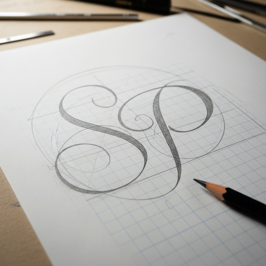
The Pencil
Every glyph begins on layout paper — a 2H pencil tracing the skeleton, then a 4B fleshing out the stroke contrast. The hand makes decisions the eye cannot yet articulate.
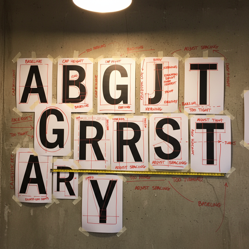
The Proof
Scanned sketches are printed at 400% and taped to the wall. Spacing is marked in red wax pencil. This is the moment the alphabet becomes a system.
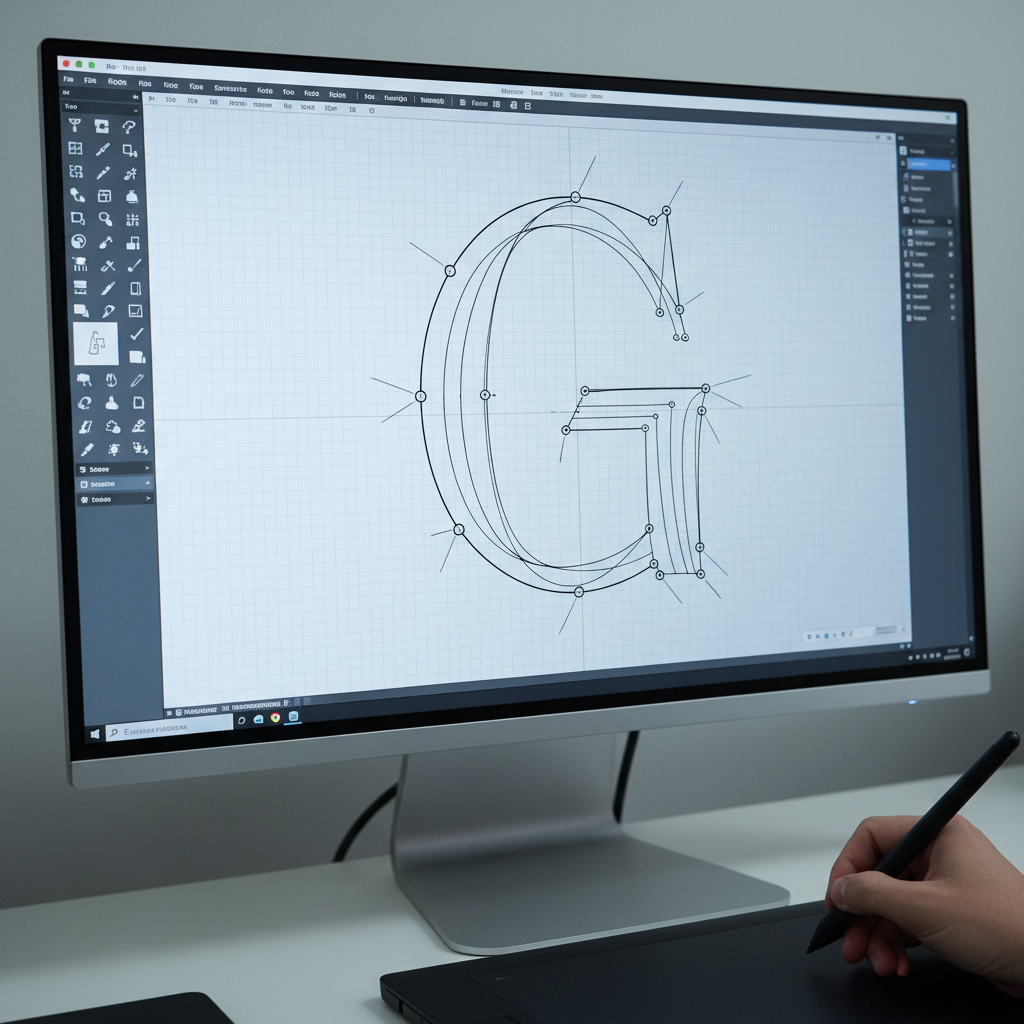
The Bézier
Only now does the cursor appear. Each node is placed deliberately — as few as possible, as many as necessary. The software is a tool, not the author.
The Pencil
Every glyph begins on layout paper — a 2H pencil tracing the skeleton, then a 4B fleshing out the stroke contrast. The hand makes decisions the eye cannot yet articulate.
The Proof
Scanned sketches are printed at 400% and taped to the wall. Spacing is marked in red wax pencil. This is the moment the alphabet becomes a system.
The Bézier
Only now does the cursor appear. Each node is placed deliberately — as few as possible, as many as necessary. The software is a tool, not the author.
Three weights. One voice. Drawn by hand in Porto over twenty-six months.
The descender carries the weight of everything that came before it.
A roman that has no interest in being neutral — only in being true.
Display weight for the moments that cannot afford to be misread.
The first sixty
licenses will not
be for sale.
They will be reserved for the people who cared enough to ask before the typeface had a name. Leave your email. Tell us if you're licensing for a brand or for yourself.
Glyph is one person working in a sunlit studio in Porto. Two to three retail families per year. Every curve drawn by hand before it touches a Bézier point.